01 · Logo
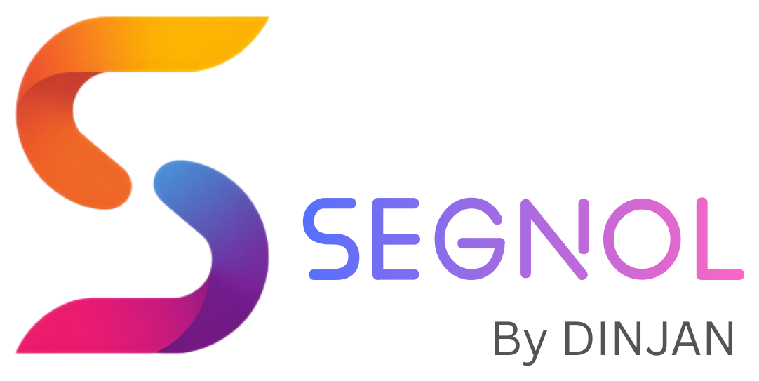
✓Use on white or very light surfaces only — add a white chip on dark backgrounds
✓Clearspace: keep one "S" height of empty space on all sides
✕Don't recolor, stretch, rotate or add effects to the mark
✕The multicolour ribbon gradient is brand-only — never use it as a UI fill or background
02 · Colour
One brand accent. Everything else is ink on canvas. Status colours mean something — don't use them decoratively.
03 · Type — Manrope, always
Manrope only, across the site and the product. No other typefaces, no exceptions.
04 · Voice
Plain, operational, second person. Warm at the door, businesslike inside. Numbers do the talking. Never emoji.
Write like this
"June payroll is ready for approval — 412 employees, 23 exceptions resolved." "PF ECR filed. Challan ready before the 15th." "Add Employee" · "Save & Continue" · "Start Onboarding"
Not like this
"🎉 Woohoo! Your payroll journey awaits!" "Revolutionary AI-powered next-gen workforce synergy" Vague claims without a number to back them
Status words: Active · Inactive · On notice · Pending · Onboarding Title Case for buttons & labels Deltas signed and coloured: +12% green, −2% red
05 · Surfaces & components
Corners
9px controls · 12–16px cards · 16–20px panels · full-round pills. Nothing sharp, nothing blobby.
Shadows
Soft, ink-tinted, low spread — 0 2px 8px rgba(18,18,18,.06). Never black, never coloured, never heavy.
Status badges
Tinted pill + dot + word. Colour never carries meaning alone.
Active Pending Onboarding
Buttons come from the Segnol design system — violet gradient primary, quiet secondary:
Need logo files or the full token set? Write to hello@segnolerp.com — we'll send the brand kit.